City of Grand Rapids - DASH Rebrand
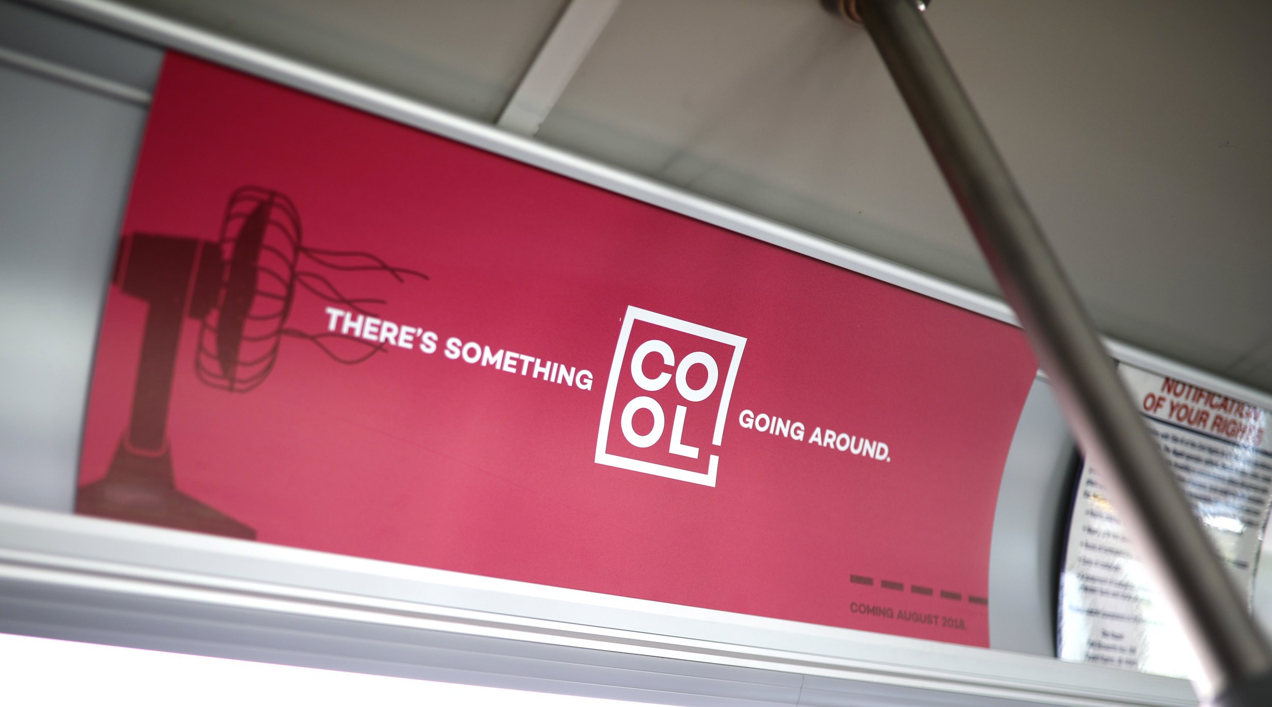
Four Letter Words
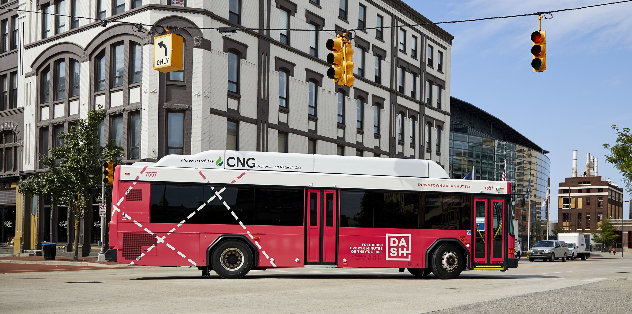
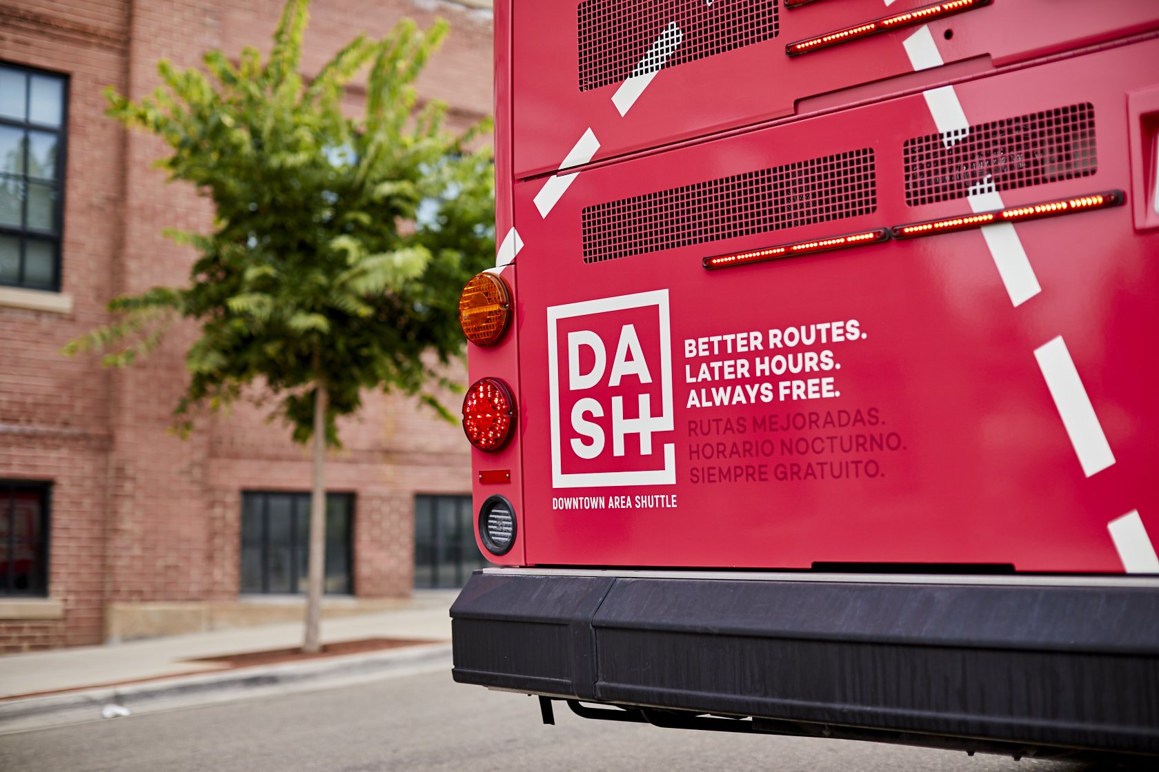
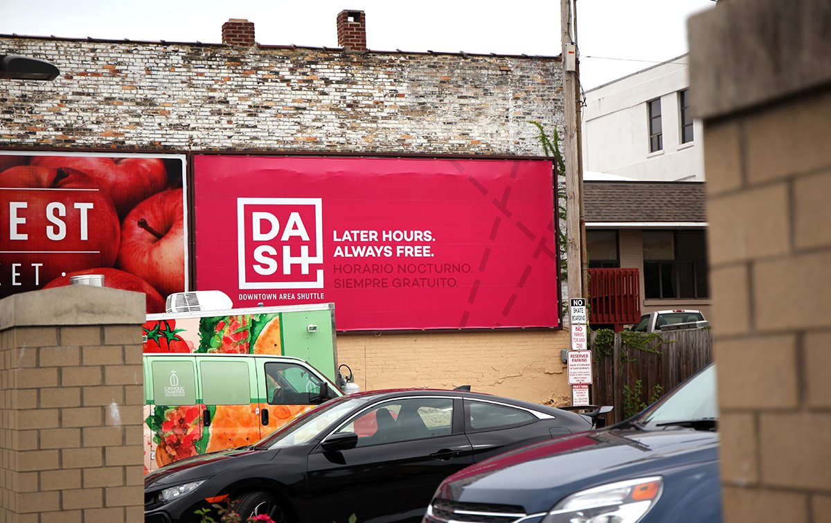
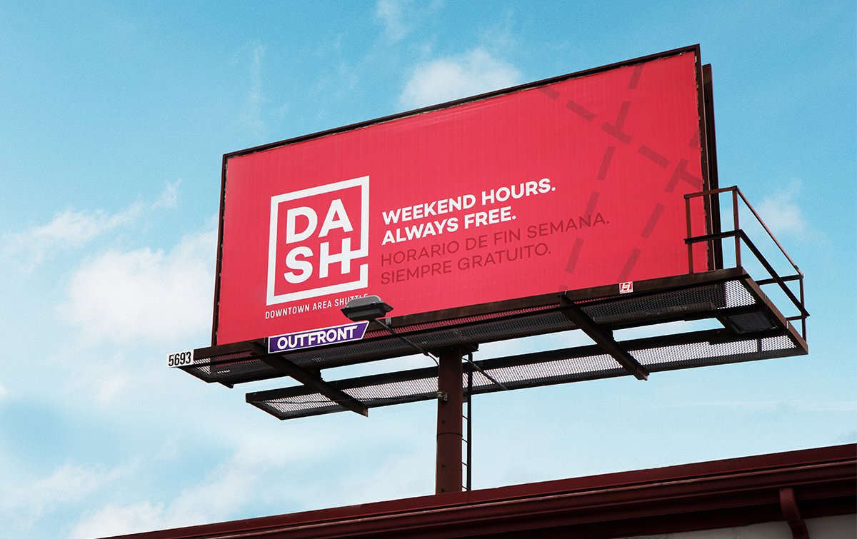
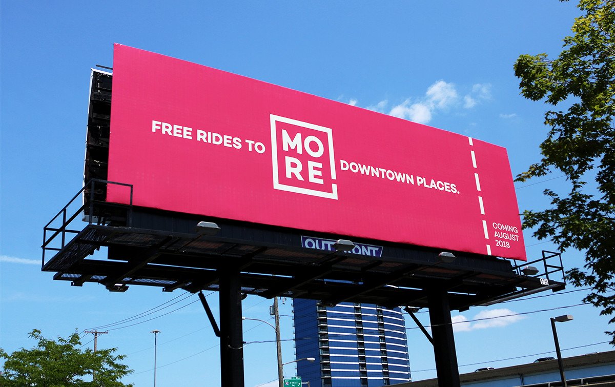
On-the-street and on-the-bus polling revealed that the DASH (Downtown Area Shuttle) name had great recognition (nearly 90%) but there was very little understanding of who the system is for, where it goes, or how it works. We had work to do: 1) Build brand awareness. 2) Demystify and increase understanding. 3) Re-energize the brand with a long overdue redesign. The “Four letter words” campaign built buzz, while the new logo and color scheme clearly differentiated the DASH from other city transit services.
PROJECT SCOPE:
Identity
Collateral
Bus Design
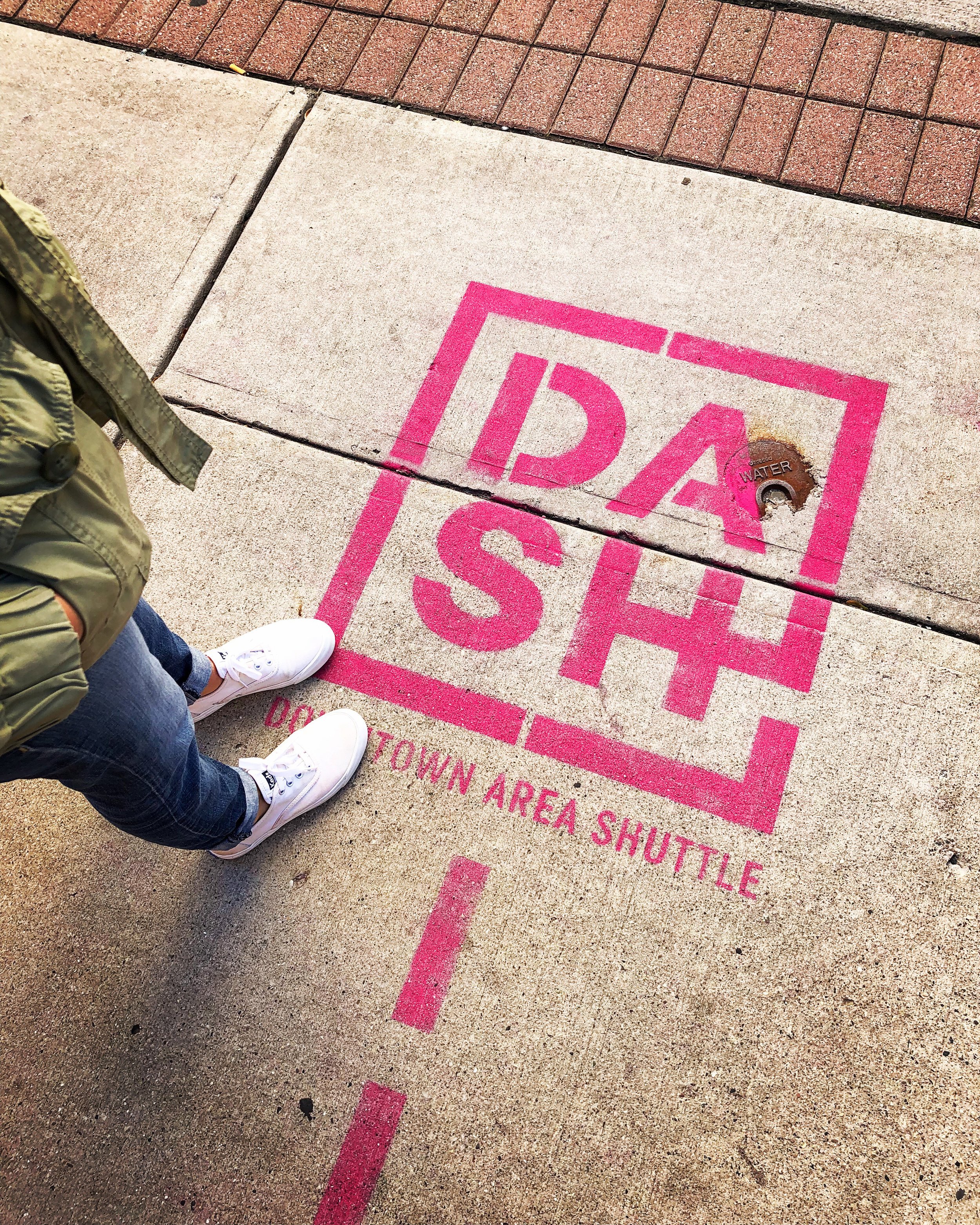
Signage / Guerilla
Outdoor
Social Media
Video Graphics
AGENCY: Grey Matter Group
GOLD & SILVER ADDY AWARD 2019
Identity

Collateral - Map / Flyer


Bus Graphics
Signage / Apparel / Guerilla


Outdoor

Brand Video